Commercial Copywriting

Landing Page for an Online Meditation Course
Challenge: The client wanted to increase course sign-ups and needed a persuasive landing page that would connect emotionally with mothers, highlighting both the problem and the solution.
Result: The landing page highlights empathy, trust, and simplicity while keeping the design visually soft and approachable.
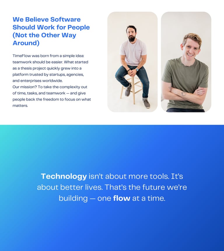
SaaS Landing Page
Challenge: A SaaS startup, needed a landing page that clearly communicated its value to startups and teams, built trust with investors, and encouraged free trial sign-ups. The original content was too generic, lacking a strong product story, clear benefits, and authority.
Result: I created a conversion-focused landing page with a bold hero headline, a humanized company story, clear feature breakdowns, and social proof through awards. The final copy positions TimeFlow as innovative yet approachable, giving the brand credibility while driving engagement and sign-ups.
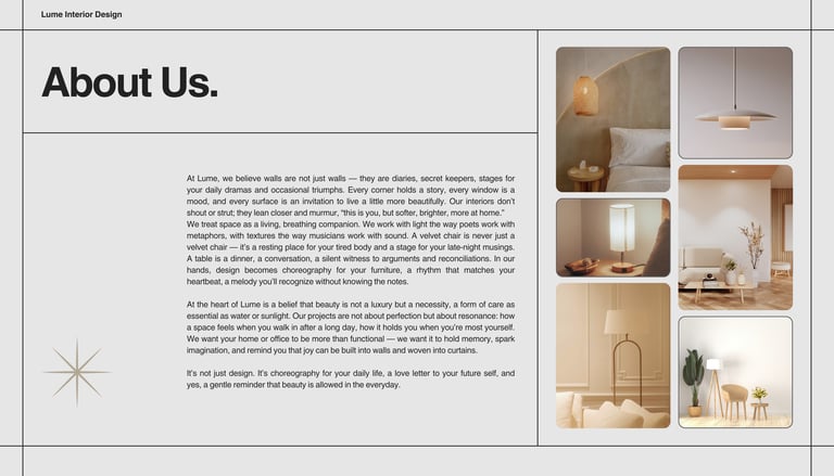

About Us Page – Interior Design
Challenge: Lume Interior Design needed an About page that would go beyond clichés and generic corporate language. The goal was to build trust with design-conscious clients while also expressing the studio’s unique philosophy: that interiors are not just functional, but poetic, personal, and deeply human. The existing draft was too flat and didn’t capture the studio’s essence or voice.
Result: I created an About page that combines lyrical storytelling with a professional tone, blending warmth and wit to reflect Lume’s brand identity. The final text positions the studio as both artistic and trustworthy: a team that choreographs spaces like music, writes with textures as poets do with words, and treats design as a love letter to everyday life. This balance of credibility and creativity helps Lume stand out in a competitive market and resonate with clients seeking style with soul.
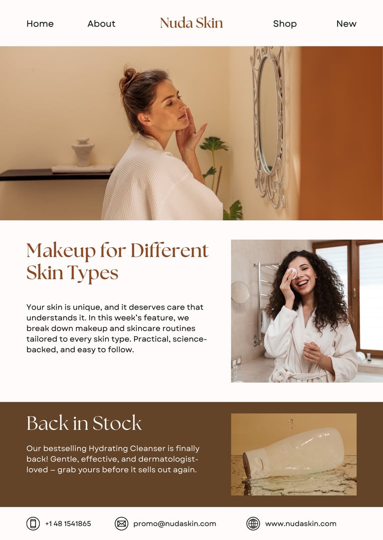
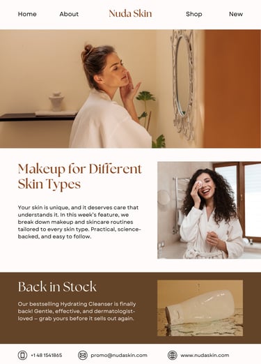
Flash Sale & Educational Email Series - Skincare Brand
Challenge: The client needed a short email sequence to boost sales during a 24-hour flash promotion and re-engage subscribers with useful content. Their previous campaigns focused only on discounts, which led to quick spikes in sales but little long-term trust or brand loyalty.
Result: I created a 2-email series that combines urgency with value: the first email announces the flash sale in bold, benefit-driven language, while the second balances education (“how to care for different skin types”) with a back-in-stock reminder. This approach drives immediate conversions while positioning the brand as a trusted skincare advisor, building loyalty beyond the promotion.


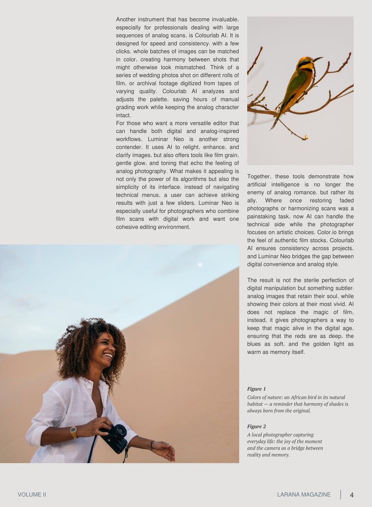
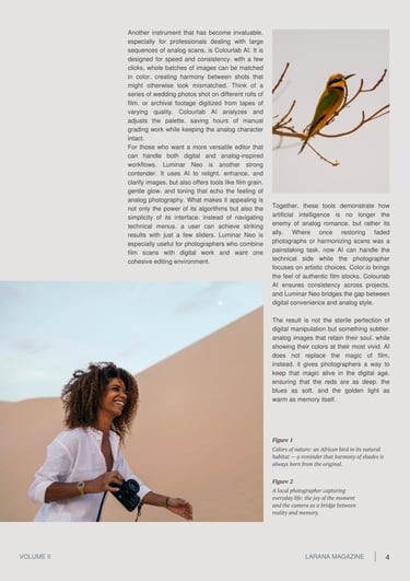
SEO Article – “AI Meets Film: Enhancing the Colors of Analog Photography”
Challenge: The editorial team needed a feature article on AI tools for restoring and enhancing the colors of analog photographs. The goal was to balance technical accuracy with a poetic narrative style, and to integrate visual elements — captions and photos — that reinforced the theme of color, memory, and authenticity.
Result: I created a 4000-character article that introduced real AI instruments in an engaging way, avoiding dry technical jargon while preserving credibility. To complement the visuals, I crafted evocative captions that linked the images of a bird and a local photographer to the article’s central theme of preserving color and soul in analog photography. The final piece reads as both informative and atmospheric, aligning with the magazine’s style.
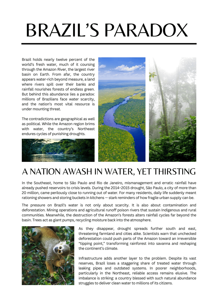
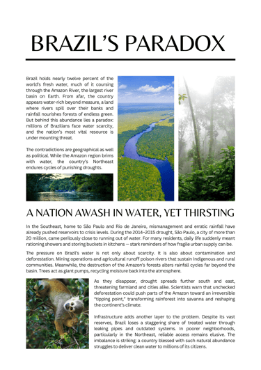
Blog Article – “Brazil’s Paradox: A Nation Awash in Water, Yet Thirsting”
Challenge: The client requested a long-form blog article on global water issues, written in a style suitable for an international audience. The focus was to highlight Brazil and the Amazon, showing the paradox of abundance and scarcity, while maintaining the voice and structure of a New York Times–style feature.
Result: I delivered a 2,500-character article that blends narrative storytelling with journalistic clarity. The text outlines the geographic and political contradictions of Brazil’s water resources, examines threats like deforestation and pollution, and points toward solutions. The style balances authority and readability, positioning the piece as both informative and engaging for a broad readership.
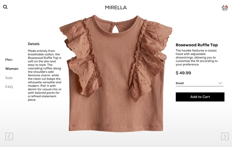
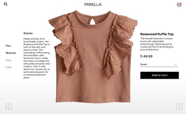
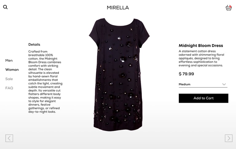
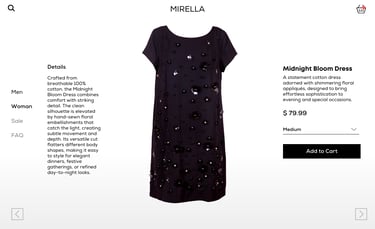
E-commerce Product Copywriting
Challenge: The client needed product descriptions that went beyond basic details to inspire purchase decisions. The brand wanted copy that highlighted the premium 100% cotton quality while aligning with its minimalist aesthetic and encouraging conversions in a highly competitive fashion market.
Result: I developed a dual-layered structure: a concise tagline under the product name to capture attention quickly, and a longer “Details” section to communicate fabric, fit, and styling versatility. This approach gave the product page both emotional appeal and practical clarity, strengthening Mirella’s brand voice and making the items more desirable to customers.
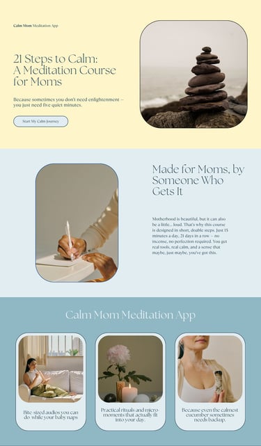
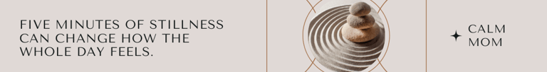
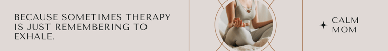
Banner Ads – Calm Mom Meditation Course
Challenge: The client wanted a set of banner ads for a new online meditation course designed for mothers. The ads needed to feel therapeutic but also approachable, with a witty and memorable touch. The challenge was to create short, impactful slogans that would resonate emotionally and visually in a crowded wellness market.
Result: I crafted three banner ad variations combining gentle, therapeutic messaging with a modern, minimalist design. Each ad highlights a different emotional hook — stillness, breath, and nervous system reset — while keeping the copy concise and persuasive. The visuals and slogans work seamlessly together to attract attention and invite clicks, showing how calm can be delivered in just five minutes a day.

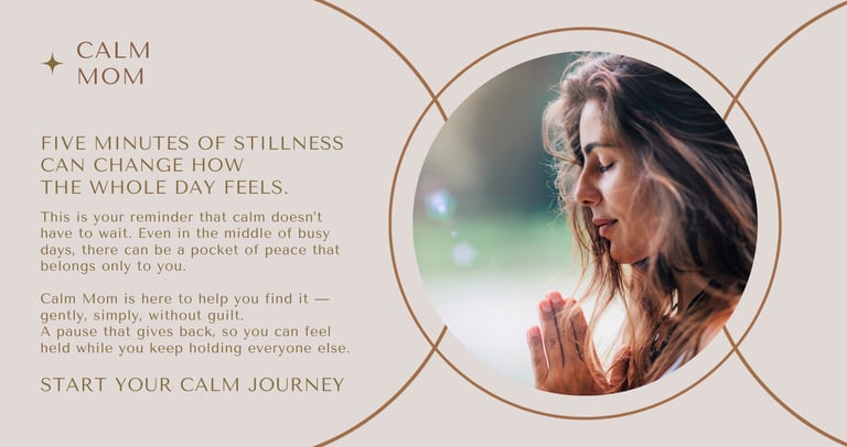
Facebook Ad – Calm Mom Meditation Course
Challenge: The client needed a Facebook ad that would speak directly to overwhelmed mothers, encouraging them to embrace self-care without guilt. The challenge was to create ad copy that felt more like a caring friend’s reminder than a hard sell, while still driving sign-ups for the course.
Result: I delivered a Facebook ad combining warm, therapeutic language with a calm, minimalist design. The headline highlights transformation, while the body text gently reassures the reader that peace is possible even in the busiest days. The call-to-action is clear but non-intrusive, inviting mothers to begin their journey toward calm in a supportive and relatable way.

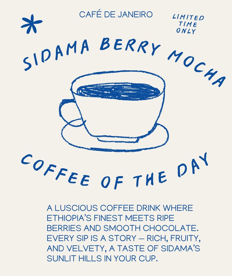
Promotional Poster — Product Copywriting
Challenge: The café needed to differentiate its seasonal drink from standard mochas and appeal to both coffee enthusiasts and casual customers. The challenge was to communicate the exotic origin (Sidama, Ethiopia) and rich flavor profile (blueberry, strawberry, chocolate) without overwhelming the reader with too much detail.
Result: I developed a concise tagline paired with minimal, bold design elements. The poster successfully balanced storytelling with clarity, creating an inviting message that sparked curiosity and encouraged trial. By focusing on sensory appeal and limited-time urgency, the promotion positioned the Sidama Berry Mocha as a must-try seasonal highlight.

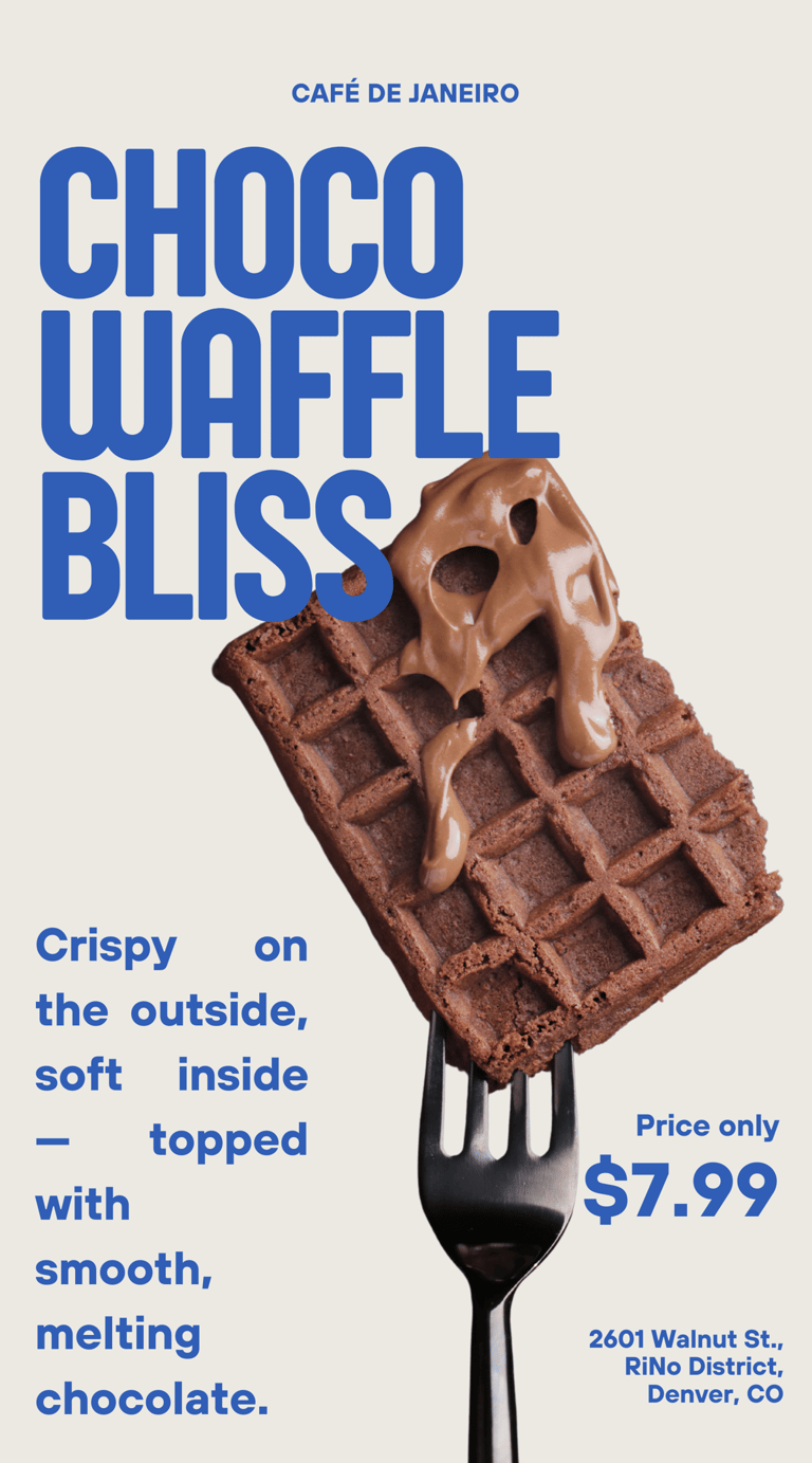
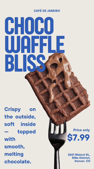
Instagram Story Ad – Café de Janeiro
Challenge: The client wanted a short, visually striking Instagram Story to promote a new dessert launch. The challenge was to capture attention in just a few seconds, making the product irresistible while also highlighting its price and location.
Result: I created a video story concept that combines bold typography, mouth-watering visuals, and concise copy. The phrase delivers sensory appeal, while the clear price and address drive immediate action. The final ad balances indulgence with clarity, designed to convert scrolling viewers into café visitors.